No products in the cart.
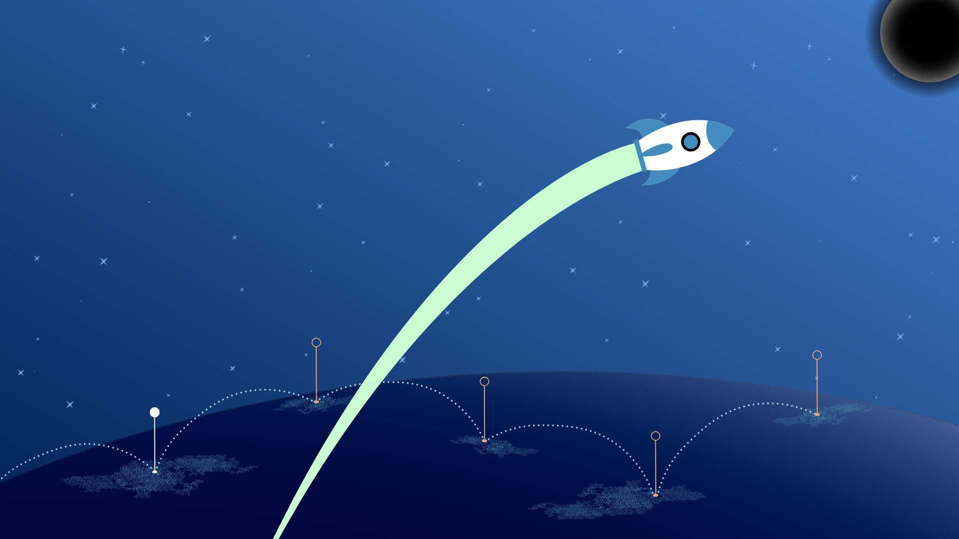
Why the Path from Landing Page to Product Is Critical for Business
Marketing no longer ends with a click. With rising traffic costs and shrinking user attention spans, every step from an ad to the first experience inside the product becomes decisive. A landing page can’t work in isolation anymore: it’s just the starting point. From there, companies either hold attention and guide the customer toward real value—or lose them forever.
The main challenge for business today is not only to capture attention, but to guide the customer from first touch to first value as quickly and seamlessly as possible. — McKinsey
That’s why the discussion about the customer journey is moving to the forefront: the clarity of its design directly determines the effectiveness of the entire marketing funnel.
Why the Path from Landing Page to Product Is Critical for Business
A landing page in modern business is not just a pretty screen with a “Try” or “Buy” button. It plays the role of an entry point—the very first step in a customer’s journey with the product. For a long time, the landing page was seen as the central conversion tool: you invest in advertising, get clicks, and a portion of visitors leave their contact details.
But in 2025, that approach has stopped working. The cost of acquisition is rising, attention has become scarce, and patience is at a minimum. It’s no longer enough to drive someone to a click: what matters is guiding them from the landing page to real product use quickly and without unnecessary friction. This is exactly where most companies face a gap—between the promise of the first screen and the actual experience inside the product.
Marketing that ends with a click no longer works. The winners are those who design the customer journey from landing page to activation. — Forrester
The Landing Page as an Entry Point: Role in Marketing and Sales
The landing page remains the first link in the interaction chain. Its job is to build trust and create motivation for the next step. In essence, a landing page is a promise of value and an invitation into the product. To make this invitation work, the landing must cover three critical questions:
- Clarity: What exactly does the company offer, and what problem does it solve?
- Relevance: Does the offer match the visitor’s need right here, right now?
- Trust: Does the brand have the credibility, cases, and transparency needed for me to believe it?
If even one of these points fails, there won’t be a click. But even with a perfect landing page, the biggest drop-off usually happens after the click—during the transition to registration, confirmation, and the first product launch.
The Main Problem: Losing Customers Between the Click and Real Product Use
The most vulnerable part of the funnel is the gap between the transition from the landing page and the first experience inside the product. This is where businesses often lose between 40% and 70% of users: long forms, mandatory email confirmations, multi-step onboarding, and a mismatch between expectations and the actual interface. The more expensive the traffic, the more painful each of these “micro-losses” becomes.
If the user doesn’t see the product’s value in the first few minutes, they will leave. Patience has become the scarcest resource. — MIT Sloan
Where Exactly Customers Drop Off
| Stage | Main Problem | Estimated Loss |
|---|
| Landing → Form | Too many fields, unclear logic | –20–30% |
| Form → Confirmation | Email doesn’t arrive / not opened | –10–15% |
| Confirmation → Product | Long onboarding, duplicate steps | –25–40% |
Every extra click is a potential drop-off point. And as CPA continues to rise year after year, losing half of the flow on “service steps” means systematically missing out on revenue and distorting marketing economics. The paradox is that teams meticulously optimize the headline and the first screen but rarely design the connection between the landing page → first valuable product experience.
Why the “Customer Journey” = The New Architecture of Growth
In 2025, the key metric shifts from CTR and lead counts to the speed and continuity of the customer journey — from the click to the moment when the user first experiences value. This is no longer a “funnel for the sake of a report,” but an architecture of end-to-end experience: the landing page sets the expectation, onboarding continues the story, and the product delivers on the promise in practice.
Growth doesn’t begin on the landing page, but at the moment the user first feels the product’s value. — Gartner
The new architecture requires:
- Minimum barriers. A short form (2–3 fields), SSO/sign-in through messengers, guest mode, or instant demo instead of mandatory registration.
- Continuity of expectations. Wording and visual patterns from the landing page are repeated on the first product screen; promises of speed/simplicity are confirmed by actual flows in the interface.
- First value within 1–2 minutes. A quick result: a calculation, import, template, free feature — anything that makes the person think, “aha, this works for me.”
- Subtle guidance. Tooltips, chat, email sequences, and in-app messages help the user through their first steps and nudge them toward the “moment of truth” without distraction.
Customer Journey Map
Click → Registration → Confirmation → First Login → First Value → Activation → Purchase
In the old model, efforts were concentrated on “getting the click and collecting the registration.” In the new model, everything is decided at the moment of “first value”: if it happens quickly and without friction, the probability of activation and payment grows dramatically. That’s why designing the journey is not just the responsibility of marketing, but also product, data/CRM, and support: it’s a unified system, not scattered tactics.
The customer journey is not a set of touchpoints, but a single system. The shorter and more logical this path, the more predictable the revenue. — Accenture
The landing page remains an important element, but it is only the door. The winners are the companies that design the customer journey as a growth architecture: removing unnecessary steps, aligning the promise with the interface, leading the user to first value within minutes, and supporting them until activation. This is how clicks turn into customers, and marketing turns into predictable economics rather than pretty metrics in a report.
Psychology and Customer Expectations
The path from landing page to product is not a corridor of buttons but a sequence of mental decisions made in mere seconds. In the digital environment, attention has become a scarce resource: users scan, compare, and instantly discard anything that doesn’t clearly answer the question, “Why do I need this right now?”
That’s why working with expectations is not cosmetic and not just “copywriting for aesthetics,” but the foundation of revenue: it is the psychological logic of the journey that determines whether a person feels the product’s value before leaving.
Customer psychology is the architecture of attention. Whoever controls the first impression controls the conversion. — Forrester
The First Seconds: How the “Instant Answer” Effect Works
The first 3–7 seconds are the “golden window” in which the user decides whether to stay on the page or close the tab. During this time, the brain works economically: it compares the user’s intended query (pain, task, or hypothesis) with what the screen shows. If there’s no match, attention collapses. That’s why the formula “offer + clarification + next step” must fit not into a paragraph, but into a few clear lines, reinforced by a visual pattern.
The visitor arrives with the question, “What will this do for me specifically?” This is why, in the main zone of visual contact, it’s crucial to show not just the category (“Platform X”) but the promised result (“Cut the path from sign-up to activation in half”). Neuroeconomists call this the “instant answer”: when the wording matches the user’s intent, a cognitive ease effect arises — it becomes simpler for the user to stay and continue.
People don’t read websites — they scan them, picking out markers of relevance. Clear phrasing reduces cognitive load and increases readiness to act. — Nielsen Norman Group
The practical takeaway is simple: the first screen must “sound” with concrete value, backed up by a short clarification, and the CTA should promise an experience, not a “paperwork” step. Instead of “Register,” use “Try it with your own data”; instead of “Leave your contact details,” use “Get a calculation in 30 seconds.” This is not wordplay but psychological tuning: a person is more likely to agree to an action that leads to immediate meaning.
The Trust Factor: Why the Customer Must Immediately Grasp the Product’s Value
Even when the “instant answer” works, the user instinctively looks for confirmation: whom to trust and why these promises specifically. Trust is built on three layers — clarity, sources, and predictability of the next step.
Clarity is not about “simplifying for the sake of simplicity,” but about eliminating fog: no jargon, with specifics and down-to-earth wording. Sources are social proof (clients, results, numbers), but they must confirm the declared value rather than exist separately as a “graveyard of logos.” Predictability means a transparent route: “what happens after I click and when I will see the benefit.”
Trust arises where the promise matches the experience, and the next step is transparent and under control. — Gartner
Trust signals:
| Element on the Landing Page | What the User Perceives | Psychological Effect |
|---|
| Specific offer + clarification | “I understand exactly what you’ll do for me” | Reduced anxiety |
| Themed social proof | “This already worked for people like me” | Transfer of trust (“if it worked for them, it can for me”) |
| Honest CTA about experience, not “paperwork” | “I’ll immediately get a result/demo, I won’t get lost” | Readiness to act |
Another key nuance is the alignment of meaning between the landing page and the product. If you promise “get started fast” but the click leads to a long form and an email confirmation, the sense of reliability collapses. Psychologically, this feels like a broken contract: one thing was promised, another was delivered. That’s why trust is not just a block with testimonials but an end-to-end experience, where each subsequent screen reinforces what was stated on the previous one.
The Problem of Cognitive Overload: How to Avoid It on the Path from Landing Page to Product
Cognitive overload happens when the amount of stimuli exceeds the brain’s readiness to process them. In the digital journey, this shows up as “heavy” text, multiple competing signals, fragmented CTAs, and complicated sign-up procedures. The result — even a motivated user postpones the action “for later” (which in reality means never).
Every extra step in onboarding costs you part of your audience; every extra form lowers the willingness to continue. — Harvard Business Review
There are three common zones of overload:
- Registration. Too many fields, the demand to “create a complex password,” a CAPTCHA, and mandatory email confirmation before access — together this destroys the intent of “let me check quickly.”
- Interface inconsistency. After clicking through, the user lands in a completely different visual world: new terms, different navigation logic. The brain spends energy on “where am I?” instead of “what do I do next?”
- Noise from tips. Pop-ups, tutorials, and blocks with “important” info get in the way of completing the single action that leads to value.
The cure is a stimulus diet: only the minimum necessary information, consistent patterns, and one primary route to the “moment of truth.” A good test is to walk through the journey yourself (or with a “cold” user) and note where micro-doubts appear: “do I really need this?” If doubt arises, it’s a candidate for simplification.
Healthy path scheme (without overload):
Landing Page → Short registration/SSO → Instant access → First value action (demo with own data) → Prompt for next step
Notice: the prompt comes after the first value, not instead of it. This way, the brain anchors the link “action → result,” and motivation stays intact.
The best way to reduce overload is to replace an abstract promise with a concrete experience of value. — MIT Sloan
The psychological logic of the journey rests on three pillars: instant answer, reinforced trust, and the absence of overload. When value is perceived in seconds, confirmed with facts, and experienced in the product without friction, users move faster and more willingly. That’s why “copywriting” here is not about words but about the design of decisions: aligning expectations with experience and turning clicks into activations and revenue.
Customer Journey Architecture
When we talk about the transition from landing page to product, it’s not just about marketing tactics — it’s about system architecture. It is a whole ecosystem where every detail — from the button on the landing page to the first action inside the product — must be aligned and serve a common goal: the fastest and most seamless path for the customer to reach value.
The customer journey is not a sequence of pages, but a chain of micro-decisions that should lead to the product experience. — Forrester
Landing Page Optimization: CTA, Micro-UX, Visual Flow
The landing page remains the entry point, but its role is not to sell a “promise,” rather to smoothly guide the customer into the product. In this context, landing page optimization goes beyond attractive design: it includes micro-UX (micro-interactions, animations, progress bars) that create a sense of ease along the path.
A CTA is not just a “buy” button, but an invitation to the next step that promises an experience. “Try for free,” “Launch a demo with your own data,” “See results in 30 seconds” — such formulations increase click-through rates and lower the barrier to the product.
Visual flow is equally important: the user should feel that each block logically leads to the next. Here, the principle of F-scanning applies: the eye moves top to bottom, left to right, picking out focal points. If the CTA is embedded into this trajectory, it feels natural.
A good landing page is a map of the journey. It doesn’t explain the entire product, but clearly shows where to go next. — Nielsen Norman Group
Bridge to the Product: Onboarding, Demos, Triggered Emails
After the click on a CTA begins the critical part of the journey — the transition from promise to experience. Here it is important not to overload the customer, but to provide the lowest possible entry barrier: simplified registration, login via social networks, or corporate SSO.
Onboarding should be short and functional: not a long tour, but the first value-driven action. For example, in a CRM this might be uploading the first contacts, in design software — creating the first project, in an analytics SaaS — importing test data.
Demo versions and trial access act as a bridge of trust. They let users “get hands-on” with the product without risk. But it’s important that the demo is not a “sandbox” disconnected from reality. The closer it is to the real experience, the higher the likelihood of conversion to a paid version.
Triggered emails support the process: reminders, tips, success stories from other clients. But they should be embedded into the logic of the journey, not exist independently.
Flow:
CTA on the landing page → Quick entry → First value-driven action → Supporting trigger → Return to the product
Integration with the Product: A Unified Ecosystem
One of the biggest mistakes companies make is the disconnect between marketing and the product. When the landing page lives “on its own” and the product lives “on its own,” the customer experiences cognitive dissonance. The result is a drop in both trust and conversion.
The solution is to integrate the landing page and the product into a single ecosystem:The solution is to integrate the landing page and the product into a single ecosystem:
- SaaS model: seamless transition from trial to full version without interface changes or unnecessary barriers.
- Freemium → Paid: the free version naturally nudges the user toward the paid version through functional or volume limitations.
- AI prompts: real-time analysis of customer behavior inside the product with suggestions for the next step.
The best customer journey is when the transition from marketing to product is invisible. The user feels like they’ve been working in the system from the very beginning. — Harvard Business Review
The key principle here is a unified logic of design, language, and values. If the landing page promises “simplicity” but the product feels complicated, the gap kills motivation.
Technological Foundation: Analytics, End-to-End Tracking, CRM/AI
For the customer journey architecture to work, you need full visibility of it. That’s why companies build end-to-end analytics — from the very first ad click to the first paying action.
Key elements:
- CRM integration — data from the landing page automatically flows into the CRM and links to the customer’s subsequent actions.
- End-to-end tracking — marketing teams see not just clicks, but real conversion inside the product.
- AI analytics — models predict exactly where the customer might “drop off” and which steps can help retain them.
| Technology | Task | Effect |
|---|
| End-to-end analytics | Connect marketing and product | Visibility of the entire journey |
| CRM | Manage customer profiles | Unified interaction context |
| AI analytics | Predictive retention | Reduced onboarding drop-off |
Without end-to-end analytics, the customer journey becomes a “black box.” Seeing the entire chain means being able to manage it. — Accenture
The architecture of the customer journey is not just a set of tools, but a designed system: the landing page directs, onboarding engages, the product reinforces, and analytics plus AI systems make the journey transparent.
Business wins when the path from click to value stops being a series of barriers and becomes a logically connected ecosystem.
Metrics and Control Points
The “path from landing page to product” stops being just a nice metaphor once you start looking at it through numbers. CTR and the number of registrations may feel good, but they often create an illusion of control. Business reality is measured by whether people come back to the product and perform actions that are directly tied to revenue.
The customer journey is not simply a marketing funnel or a product cohort in isolation — it is the sum of both, aligned over time.
Without data, the customer journey remains just a hypothesis. Once you start measuring the entire path, the exact points where money leaks out become clear — and they are usually inside the product, not the ads.
Where Customers Drop Off: Drop-Off Analysis (Landing → Registration → Product)
If you map out the customer journey on a single timeline, it turns out that most losses don’t happen at the ad click stage, but between the moments of “promised” and “delivered value.” On the landing page, the user has already mentally agreed to move forward; what holds them or pushes them away afterward is the logic of entry and their first experience of value. That’s why drop-off analysis starts by questioning the bridge from landing → product, not the traffic itself.
Imagine a typical scenario. 10,000 people land on the page. 1,200 reach the form; 480 complete registration; 160 enter the product and perform their first meaningful action; 70 return on day 7; 40 on day 30. On paper, “registration = 40% of intent” looks decent, but the end-to-end picture tells another story: return on day 30 is just 0.4% of clicks. This shift reframes the company’s internal discussion: it’s no longer about “which channel delivers cheaper leads,” but about pinpointing exactly where the experience breaks after the promise of value.
A mini-table captures only the order of magnitude — what matters most is how you read these gaps:
| Stage of the Journey | Conversion from Previous | What the Gap Indicates |
|---|---|---|
| Landing → clicks on the form | 12% | Did the offer match expectations? |
| Form clicks → completed reg. | 40% | Entry barriers and trust |
| Registration → first value action | 33% | Quality of onboarding and “moment of truth” |
| D+7 return | 44% | Did the value stick? |
| D+30 return | 57% | Has a habit formed? |
Drop-offs aren’t usually “interface rough edges” — more often they’re mismatches between expectations and experience. The landing promises “launch a campaign in a minute,” but the product greets users with a long questionnaire and email confirmation. The user doesn’t argue — they disappear.
That’s why drop-off analysis must always be read together with the copy on the first screen, the registration requirements, and the substance of the very first in-product action.
The biggest leaks happen between the promise and the first experience of value. If the path to the “moment of truth” takes more than a couple of steps, you’re paying for clicks — but leaving money on the table.
Core KPIs: Activation Rate, Product-Qualified Leads (PQL), Retention at 7/30 Days
Once the drop-off map is clear, the next question arises: which numbers describe the true health of the customer journey? The answer lies in three pillars that together form one coherent story.
Activation rate — the share of users who not only entered the product but performed their first meaningful action. This isn’t “filled out a profile,” but rather “processed a payment,” “imported contacts,” “built the first report” — actions with direct economic significance. When activation is low, the problem almost always lies in the bridge: registration barriers, extra steps, or the absence of a clear “what to do right now.”
Product-qualified leads (PQLs) — users whose behavior statistically predicts payment. A PQL is not “warmth by gut feeling” but a precise set of triggers: volume of uploaded data, number of active objects, connected integrations. The value of PQL lies in uniting product and sales: a lead is “qualified” not by a pitch deck, but by their actual in-product behavior.
Retention at 7/30 days — the test of whether value becomes a habit. D+7 shows that the user returned to solve their task; D+30 means the solution has entered their regular workflow. This pair eliminates false victories: a spike in activation without retention is merely a well-designed first screen, not product–market fit.
Registration – probability. Activation – intent. PQL – revenue prediction. Retention – revenue delivered.
These metrics must be read in combination. High activation with low D+7 means the “moment of truth” was engineered but value doesn’t stick; high PQL with weak D+30 means sales are promising more than the product can sustain over time. In both cases, the fix lies not in channels, but in the experience.
How to Calculate “End-to-End Conversion” (From Click to Repeat Usage)
End-to-end conversion is an attempt to express in a single number how much of the market’s attention actually turned into repeat usage. The calculation is simple and transparent:
End-to-end conversion = (number of users who returned on day 30) ÷ (number of ad clicks)
If you start with 10,000 clicks and 100 people return on D+30, the end-to-end conversion = 1%. The number may seem harsh, but it reveals the real economics of linking marketing and product: not the “cost per click,” but the cost of a returning user. And it is from this figure that LTV:CAC should be calculated, not from neatly “polished” registration stats.
It is also useful to look at the breakdown of end-to-end conversion across stages — to see which layer of the architecture is “failing”:
| Metric | Value | Contribution to End-to-End |
|---|
| Registration / Click | 10% | ×0.10 |
| Activation / Registration | 40% | ×0.40 |
| D+7 / Activation | 45% | ×0.45 |
| D+30 / D+7 | 55% | ×0.55 |
| Total (Click → D+30) | — | ≈ 1% |
Sometimes it is precisely this math that shifts the internal team discussion:
“Why is our CAC increasing?” — “Because we’re buying traffic into a funnel where the path to repeat use isn’t designed.”
The role of marketing changes too: its job is no longer just to “bring people in,” but to bring those who will make it to D+30 — while the product must meet them with an experience that retains.
The most useful marketing metric is not CTR and not cost per lead, but the share of clicks that turned into repeat usage. Everything else is an interim illusion.
Metrics and control points are the lens through which the true architecture of the customer journey becomes visible. Drop-off analysis shows where promises diverge from experience; activation rate, PQL, and retention describe the strength of the first steps and the durability of value; end-to-end conversion unites marketing and product efforts into a single number that the CFO can understand. In this logic, debates about “which channel brings more leads” lose meaning: the winner is the one whose path to first and repeat experience is designed so that the numbers simply confirm what the user already feels.
Practical Strategy for the Transition
When we talk about moving from landing page to product, it’s important to understand: this is not a one-time tweak to a form or a CTA button. It’s an architecture that connects marketing and product into a single system. The strategy must operate across two horizons at once — quick improvements that deliver a noticeable lift in conversion within 90 days, and long-term changes that transform the customer journey into a sustainable system of product-led growth.
Companies don’t win by changing everything at once. They win by building a systematic journey: from promise to value. — Brian Balfour, Reforge
Customer Journey Map: Visualizing the Steps from Landing Page to Product
The first step of the strategy is to build a customer journey map. This is not an abstract diagram, but a concrete visualization of all the points a user passes through:
Landing Page → Click on CTA → Registration → Onboarding → First Value Action → Repeat Usage → Conversion to Paying Customer
Visualization allows the team to see not just “pieces of the funnel,” but a unified system. The map highlights:
- % of transitions between steps;
- the time a customer spends at each stage;
- key barriers (e.g., “complicated registration form” or “no guidance during onboarding”).
| Journey Stage | Conversion from Previous | Main Barrier |
|---|
| Landing Page → CTA Click | 12% | Unclear value of the offer |
| Registration → Product Entry | 40% | Long form, email confirmation |
| Entry → First Action | 33% | No “quick win” in onboarding |
| 30-Day Retention | 10% | Value didn’t stick |
Such a map becomes a working tool for marketing, product teams, and analysts.
Quick Wins: What to Implement in 90 Days
The strategy should begin with “small steps” that deliver quick ROI. This usually involves:
- Simplifying registration forms — remove unnecessary fields, enable login via Google or social media.
- Onboarding through “instant value” — show demo data or a ready-made example so that the customer sees the benefit within 1–2 minutes.
- Trigger emails and reminders — engage the user with the product right after registration instead of waiting for them to return on their own.
The best product strategies don’t start with massive transformations, but with quick wins that convince both the team and the market of the approach’s value — Andrew Chen, Andreessen Horowitz
It is important to note that a “quick win” does not replace the broader strategy, but provides the momentum to move forward: the team sees conversion growth, investors see results, and users experience an improved journey.
Long-Term Perspective: Building a System of Product Growth
Once the first improvements are in place, it is time to think systematically. The key concept here is the seamless transition, where the customer does not feel any boundaries between the landing page and the product.
Core elements:
- Unified visual language: the design of the landing page and the product interface must speak the same language.
- Integration with CRM and AI analytics: customer tracking should not end at registration but continue inside the product.
- Real-time feedback: the product should respond to customer behavior — with hints, personalized offers, and dynamic scenarios.
The future of growth is not about more clicks, but about fewer frictions along the customer journey — Tomasz Tunguz, Redpoint Ventures
A long-term strategy transforms the journey from a set of steps into an ecosystem, where every element works toward overall retention and monetization.
Market Leader Case Studies: Examples of Companies That Built Seamless Transitions
The value of the strategy is best seen through examples.
- Slack. The landing page promises simple team communication. Registration takes just minutes, and upon the first login, the user enters a workspace with ready-made prompts. The seamless transition is achieved by providing quick access to the “core action” — messaging.
- Notion. From the landing page, customers see concrete use cases (“manage projects,” “organize knowledge”). During registration, templates are offered that immediately demonstrate value. The result: high activation rate and retention.
- Canva. The entire journey is built around demonstrating value within seconds. The landing page promises “design without effort,” and upon first login, the user gets ready-to-use templates and can create a design in one click.
| Company | Key to Seamless Transition | Effect |
|---|
| Slack | Prompts and ready workspace | High activation rate |
| Notion | Templates, scenario demos | Growth in PQL |
| Canva | Instant access to templates | 7/30-day retention |
Practical strategy for the transition is a balance between quick wins and long-term architecture. The customer journey map reveals weak points, quick wins provide energy at the start, and systematic work on the seamless transition solidifies growth.
In the end, the winner is not the company with the most beautiful landing page, but the one whose path from click to product becomes a natural continuation of value — Brian Balfour, Reforge
Conclusion: From Click to Value
The customer journey is not just a set of steps, but an architecture that connects marketing, product, and user psychology into one system. The landing page makes the promise, but it’s the transition to the product that determines whether a click turns into revenue.
Today it’s not enough to “drive traffic.” Companies that think only in terms of CTR and cost per lead lose customers at the very point where growth should be born. The true source of competitive advantage lies in the seamless transition: a short path, trust, no overload, and an instant sense of value.
Marketing wins clicks. Product wins markets. Only together do they build growth — Brian Balfour, Reforge
Key takeaways:
- The first seconds decide the customer’s fate, and trust secures their choice.
- Drop-off analysis shows where money leaks out of the journey.
- Metrics like activation rate and PQL matter more than CTR and registration counts.
- Quick wins provide energy, but long-term strategy builds a growth system.
Market leaders like Slack, Notion, and Canva show that seamless transitions are possible in any niche. The goal is not just to create a landing page or an interface, but to design a unified journey from promise to value.
The future of product growth is not more advertising, but fewer frictions along the customer journey — Tomasz Tunguz, Redpoint Ventures
For businesses, this means one thing: strategy should be measured not by the number of clicks, but by the number of customers who return and pay. In an era where users decide within seconds, the winners will be those who build not landing pages, but journeys.